Design System London: Accessibility in the GOV.UK Design System
I was invited to speak at Design Systems London, these are the slides with my speakers notes.
I’ve put together some of the tweets in a Twitter moment, if you’re into that.
All the sources are linked from the speakers notes in the footnotes.
Slides
Hey everyone, I’m Nick Colley, I’m a frontend developer at the Government Digital Service
 Open full size image for slide 01
Today I wanted to talk to you about accessibility in the GOV.UK Design System
 Open full size image for slide 02
GOV.UK is the best place to find government services and information online.
You might have used GOV.UK to...
 Open full size image for slide 03
 Open full size image for slide 04
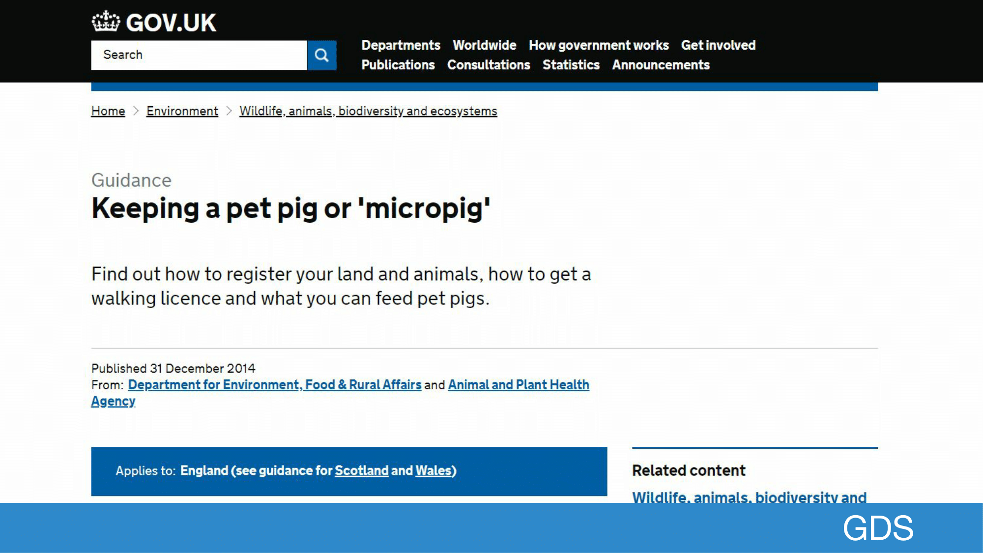
to check guidance on keeping a micropig.
You’re basically a farmer if you keep a micropig, you might need a license to walk it.
 Open full size image for slide 05
 Open full size image for slide 06
I think it’s worth talking about how GOV.UK was put together to give context to why Government might need a design system.
Open full size image for slide 03
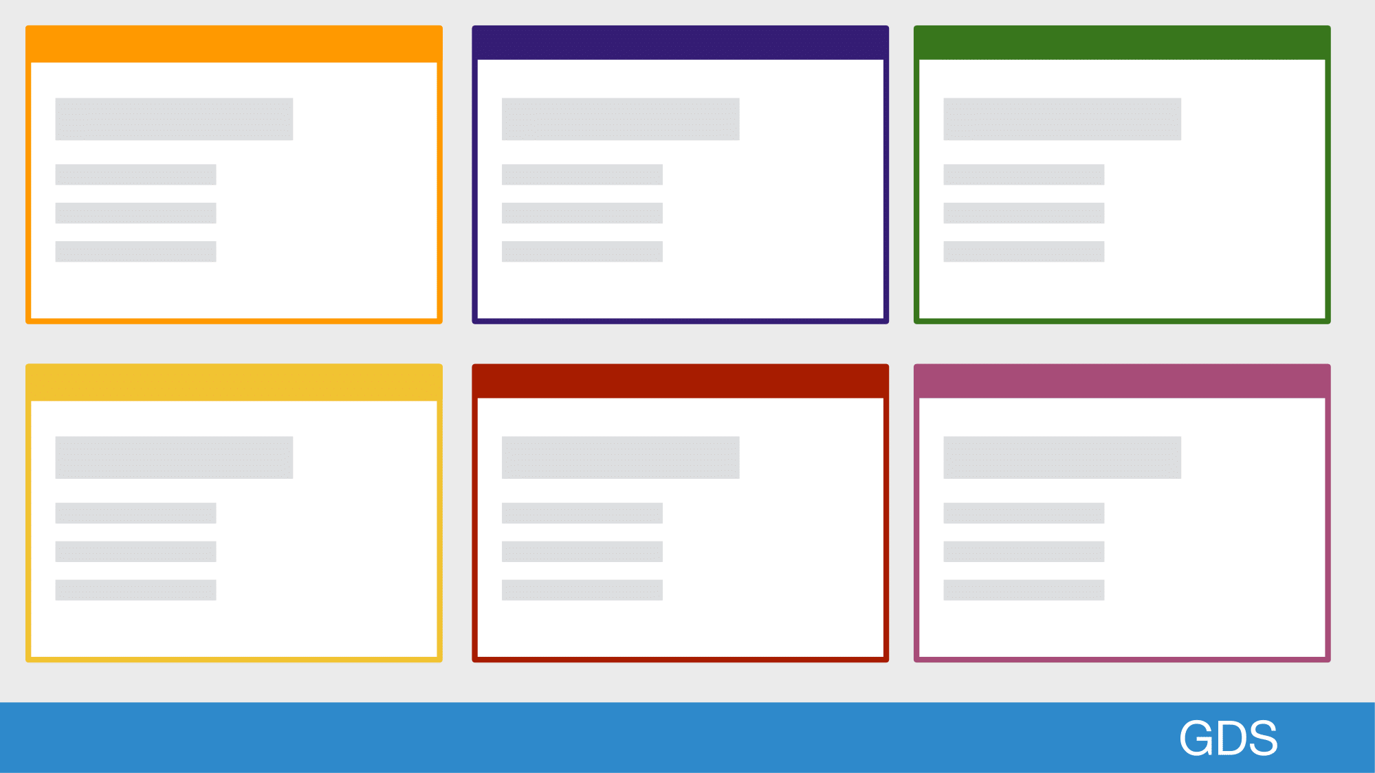
Before GOV.UK, there were a ton of differents websites that looked and behaved differently but fundamentally served a similar purpose.
From the user’s point of view there’s no need for them to be different.
 Open full size image for slide 08
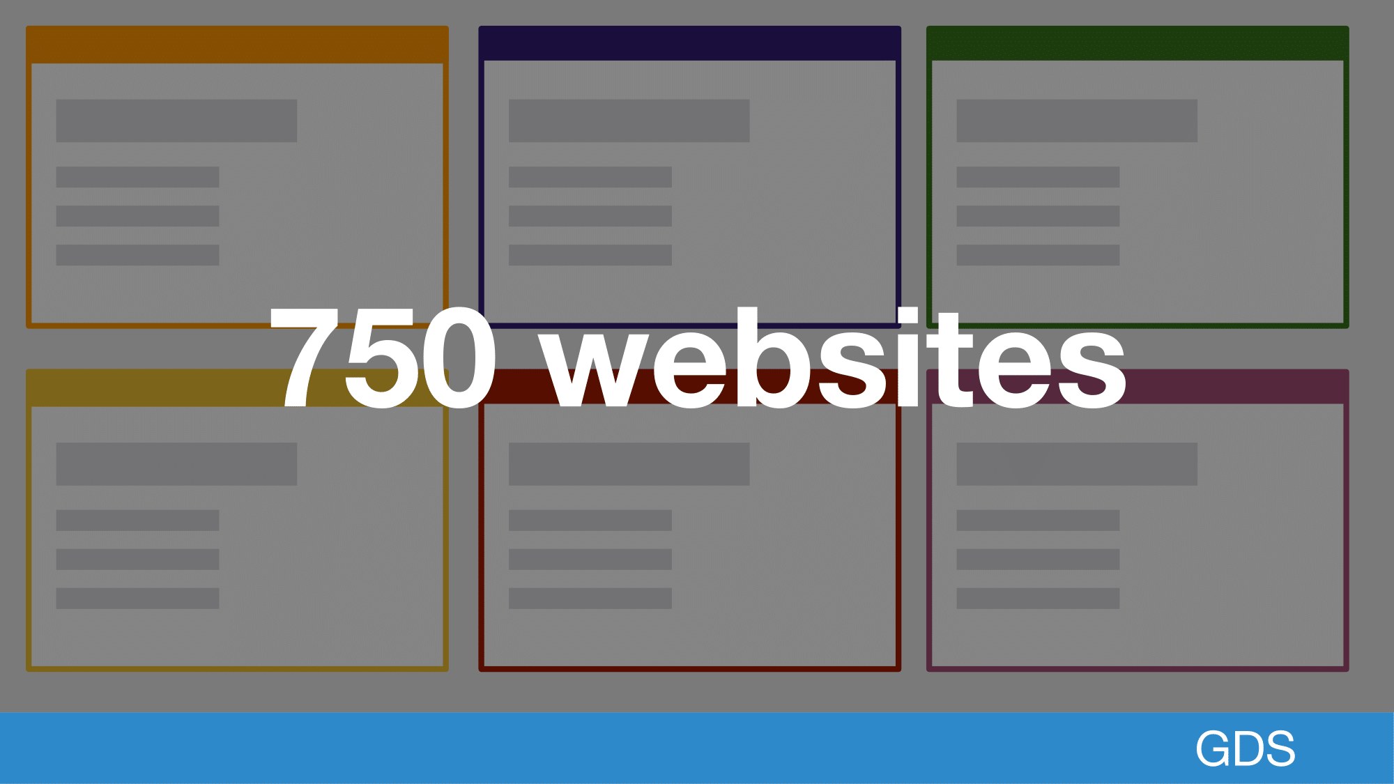
We needed to go from 750 websites domains to one top level domain.
 Open full size image for slide 09
While this has taken time, most content is now in one place with a consistent user experience and brand.
We now have more than 300 thousand pieces of content from across government published and GOV.UK now has more visits in a single month than there are people in the UK.
 Open full size image for slide 10
But government online is not just content, it also includes transactional services that rely on users inputting data.
 Open full size image for slide 11
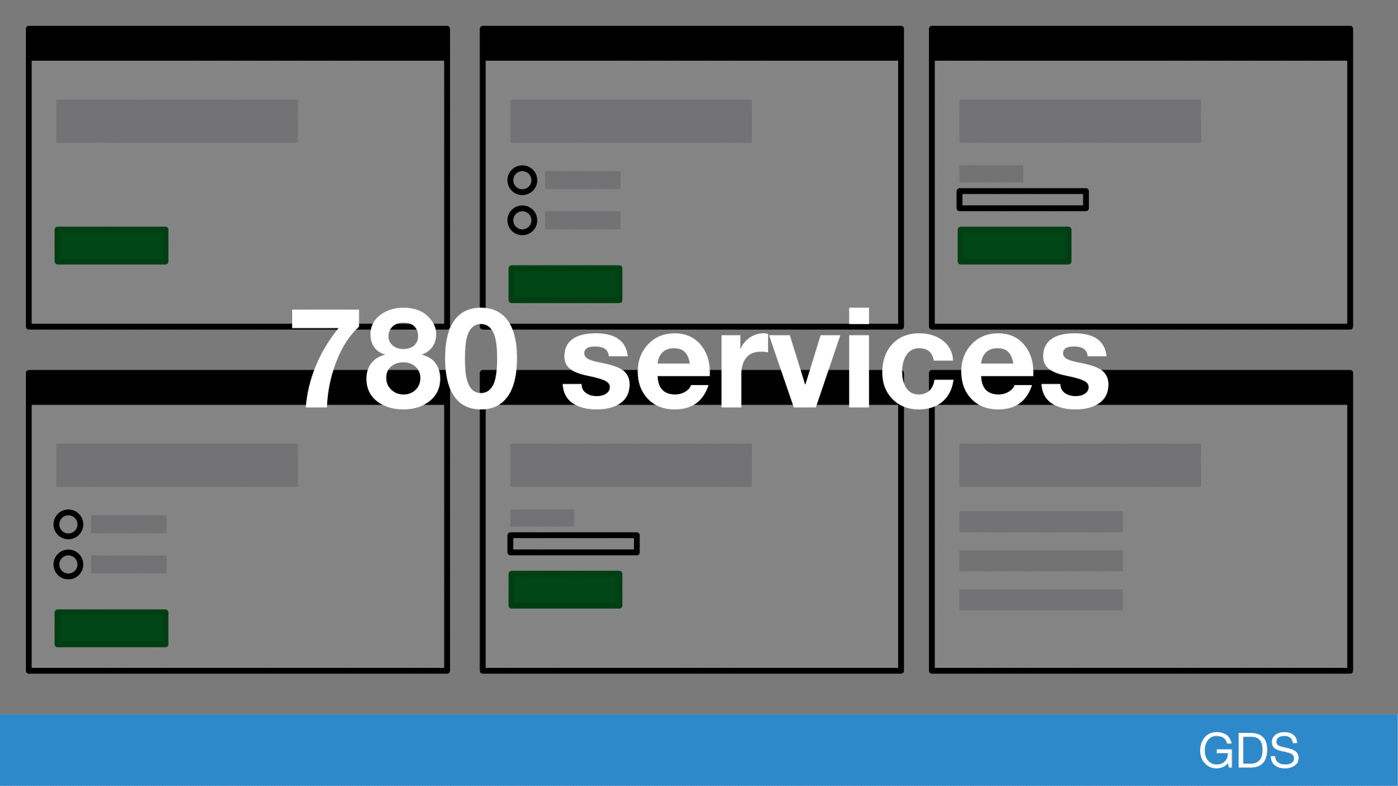
There are currently 780 services that account for over a billion transactions a year.
 Open full size image for slide 12
So why does Government need a design system?
If merging a bunch of sites together gave a consistent experience surely we don’t need a design system, problem solved.
 Open full size image for slide 13
From a technical perspective, content can be centralised, services cannot.
This means that departments across the UK are, building services in different technical stacks. On different domains. That all need to look and feel the same.
 Open full size image for slide 14
For example, a business wanting to hire their first employee needs information and services from 5 different areas of government. before they can hire them.
 Open full size image for slide 15
Here’s a totally not fake or exaggerated user journey, to try to illustrate this.
 Open full size image for slide 16
The user could start on a content page, which is run by GDS, then they could go through any number of departments running services.
 Open full size image for slide 17
These departments all use different technologies but for the user it should look like nothing has changed
 Open full size image for slide 18
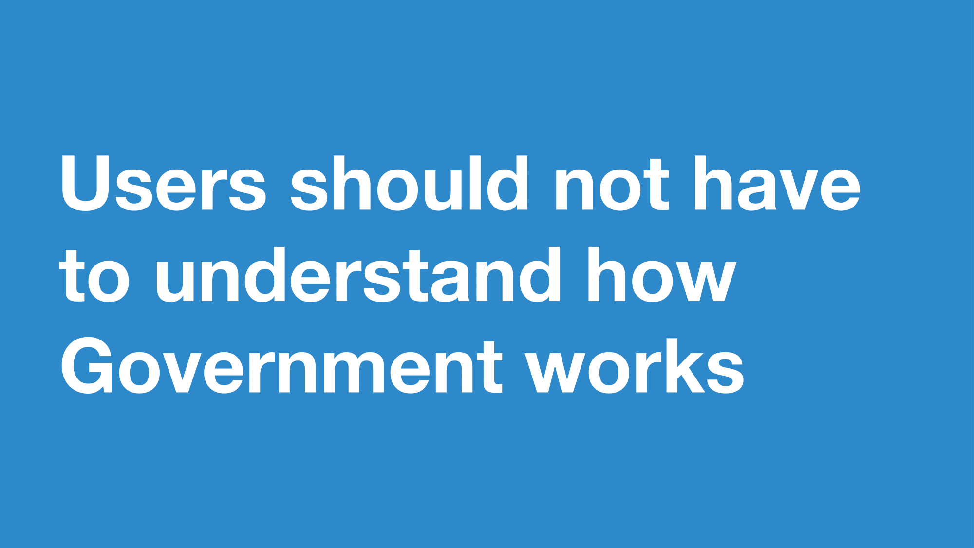
Users should not have to understand how government works.
So how do you create a consistent experience for both content and services with distributed teams?
 Open full size image for slide 19
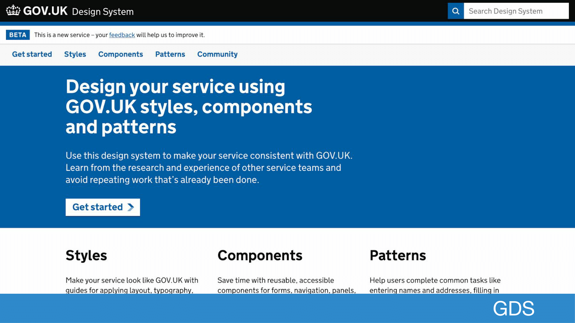
This where the GOV.UK Design System comes in, it’s built from years of research and work from teams across government.
There were already volunteer led projects that laid the foundation but this is the first time we’ve had a dedicated team to work on this problem.
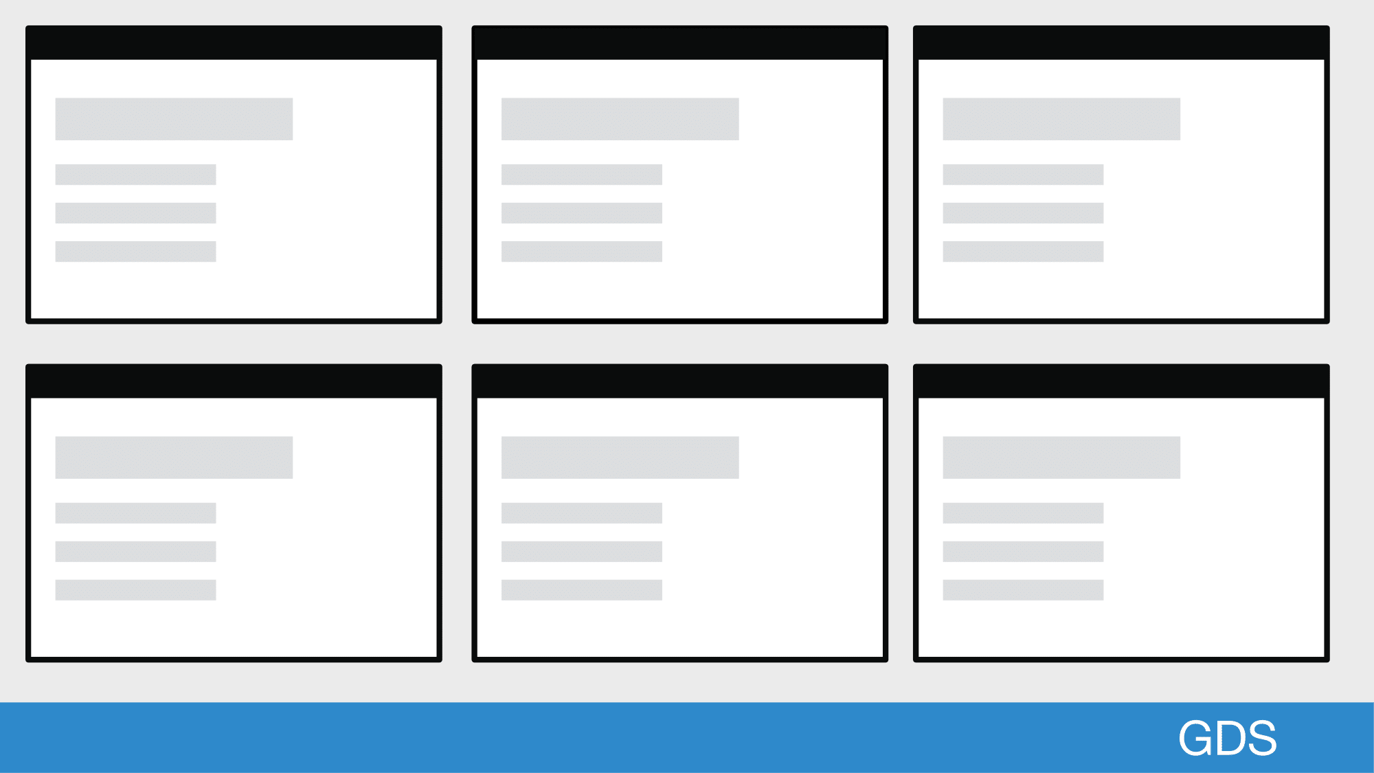
The GOV.UK Design System brings together styles, components and patterns.
 Open full size image for slide 20
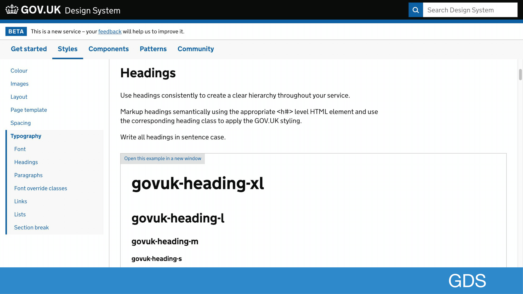
So for styles, we have things like color, spacing, layout and typography
 Open full size image for slide 21
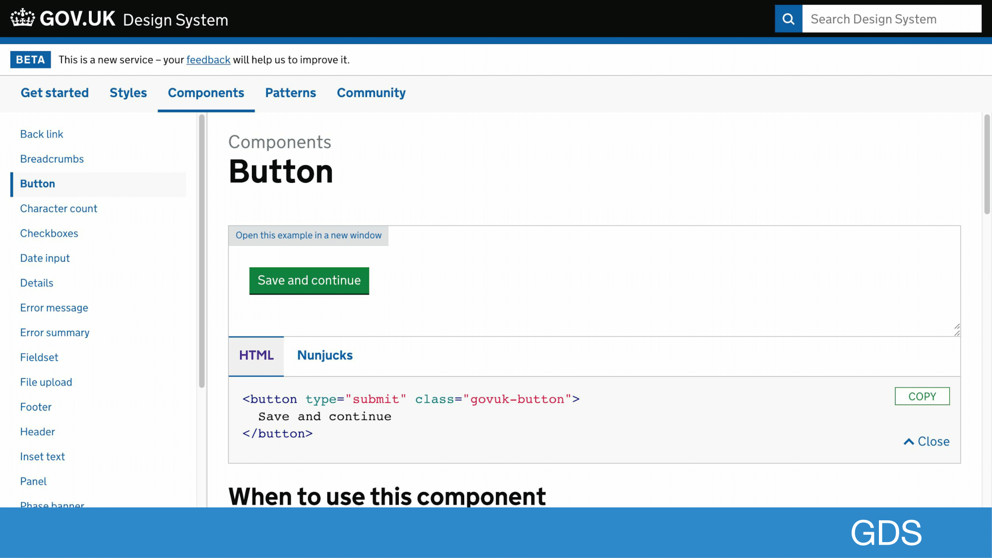
For components, we have things like buttons, tabs, and checkboxes. These tend to be used in many different scenarios.
 Open full size image for slide 22
Then finally we have patterns, you might have heard these refered to as design patterns.
These patterns often give context to where components should be used, but patterns do not need components to exist.
 Open full size image for slide 23
Something we spend a lot of time on is in the GOV.UK Design System is accessibility.
But why do we care about accessibility?
 Open full size image for slide 24
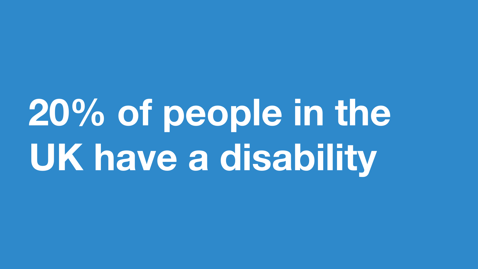
20% of people in the UK have a disability
this could be a visual, hearing, motor or cognitive (affecting memory and thinking) impairment
 Open full size image for slide 25
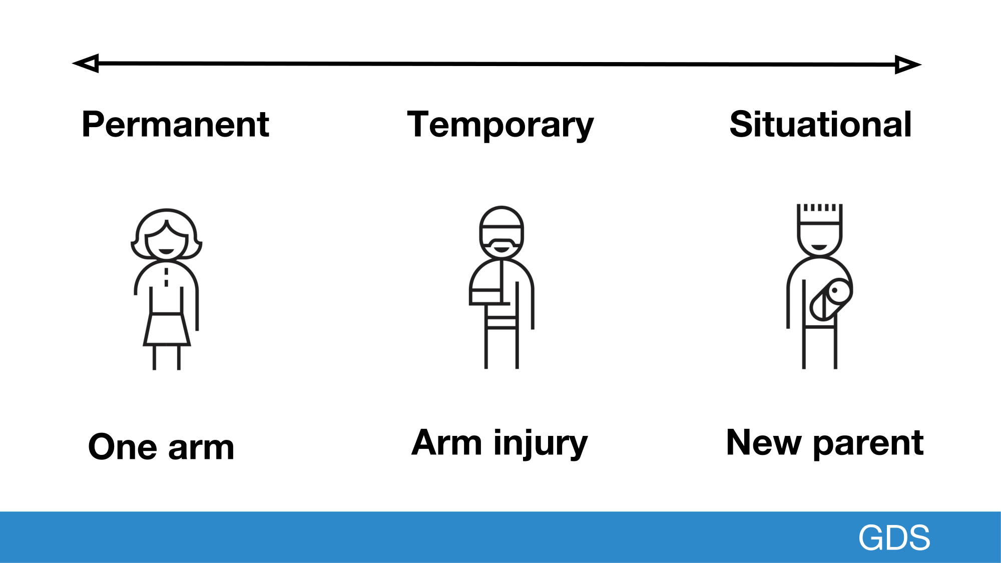
But if we think about accessibility in terms of exclusion and inclusion, we can think about people’s experience as a spectrum, which includes even more people.
The example I’m showing today is from Microsoft’s Inclusive design toolkit.
It shows how motor based impairments can impact anyone.
Someone who has lost motor function in one arm might operating a keyboard to be difficult.
But if you broke your arm skiing, you could experience some of the same barriers.
This is called a temporary impairment, since over time your arm will heal.
The final end of the spectrum is a busy new parent who is holding their child, restricting the use of one arm.
This is a situational impairment, but by designing for someone with a permanent disability we make our services usable to everyone on this spectrum.
 Open full size image for slide 26
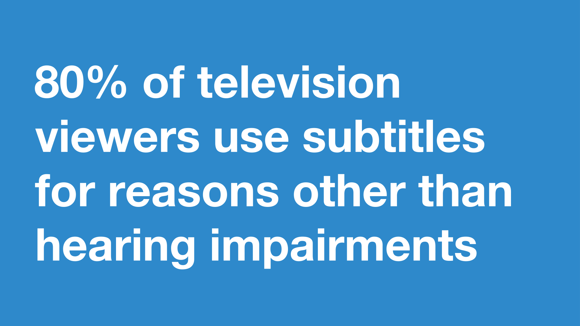
One example of this I wanted to share with you is about subtitles, otherwise known as closed captions.
Ofcom did a study which found that 80% of television viewers use subtitles for reasons other than hearing impairments.
We can see this too in social media, where often videos will autoplay without sound and include subtitles which is useful in situations where you’re on the go and can’t listen to a video.
 Open full size image for slide 27
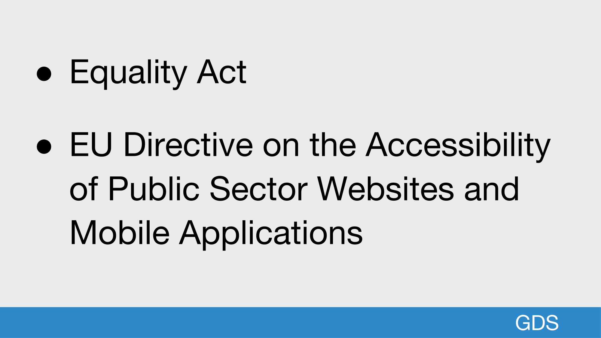
Raise your hand if you work in the public sector, or with charities.
Cool, this slide is for you 😊
In the public sector, there are also two regulations worth knowing
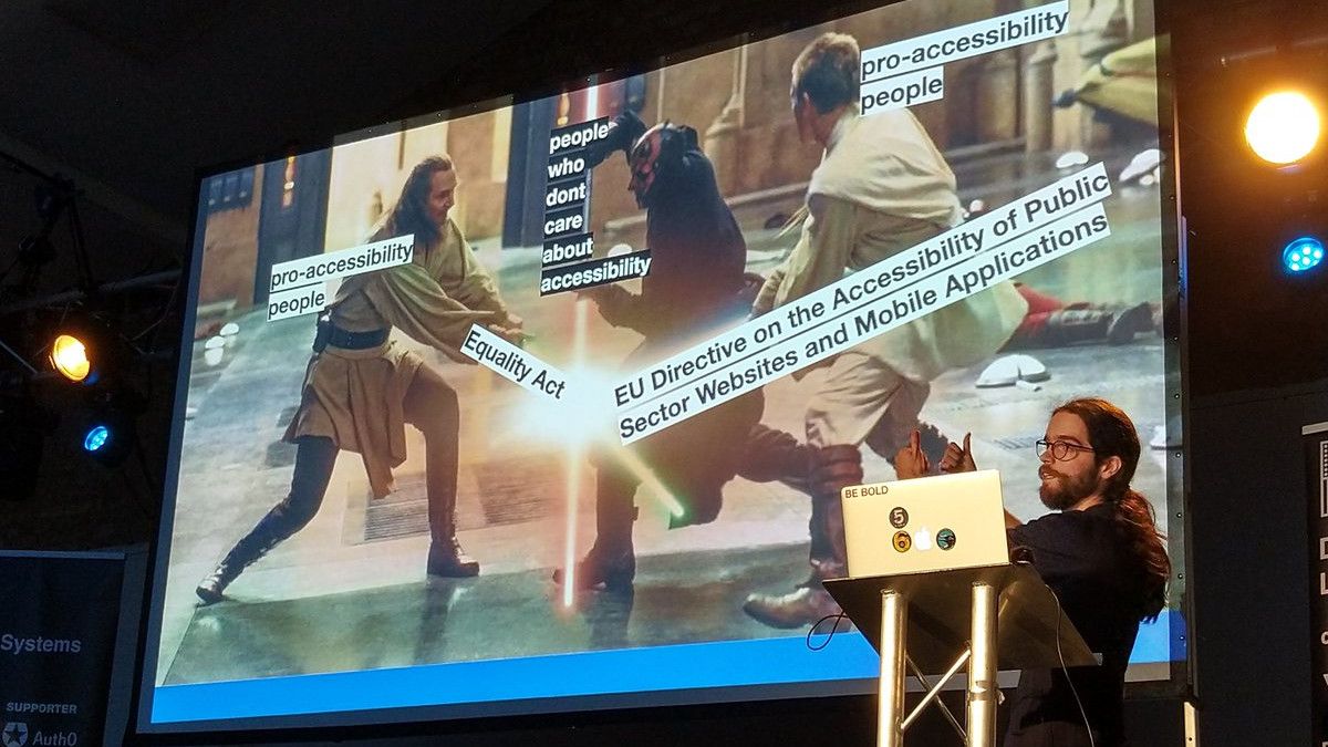
The Equality Act 2010 legally protects people from discrimination in the workplace and in wider society.
But more recently there has been the introduction of an EU directive which is more specific to web and mobile applications, so can be enforced easier.
These useful to make a business case for accessibility in the public sector.
 Open full size image for slide 28
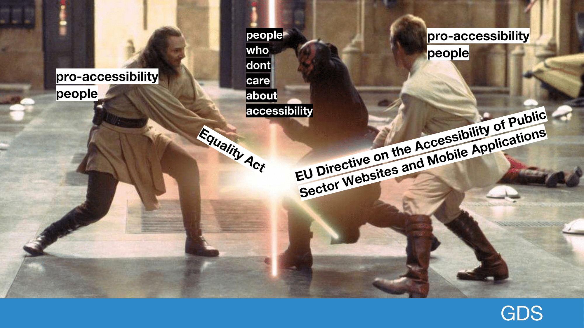
Soooo I tried to make a meme, but the EU directive is so long it doesnt really make sense.
Cant remember if Darth Maul gets beaten or not, doesnt the long hair dude get killed? I guess that’s what doing accessibility work is like sometimes...
 Open full size image for slide 29
How do we meet these needs?
For time, I’ve focused on just a few things we do.
 Open full size image for slide 30
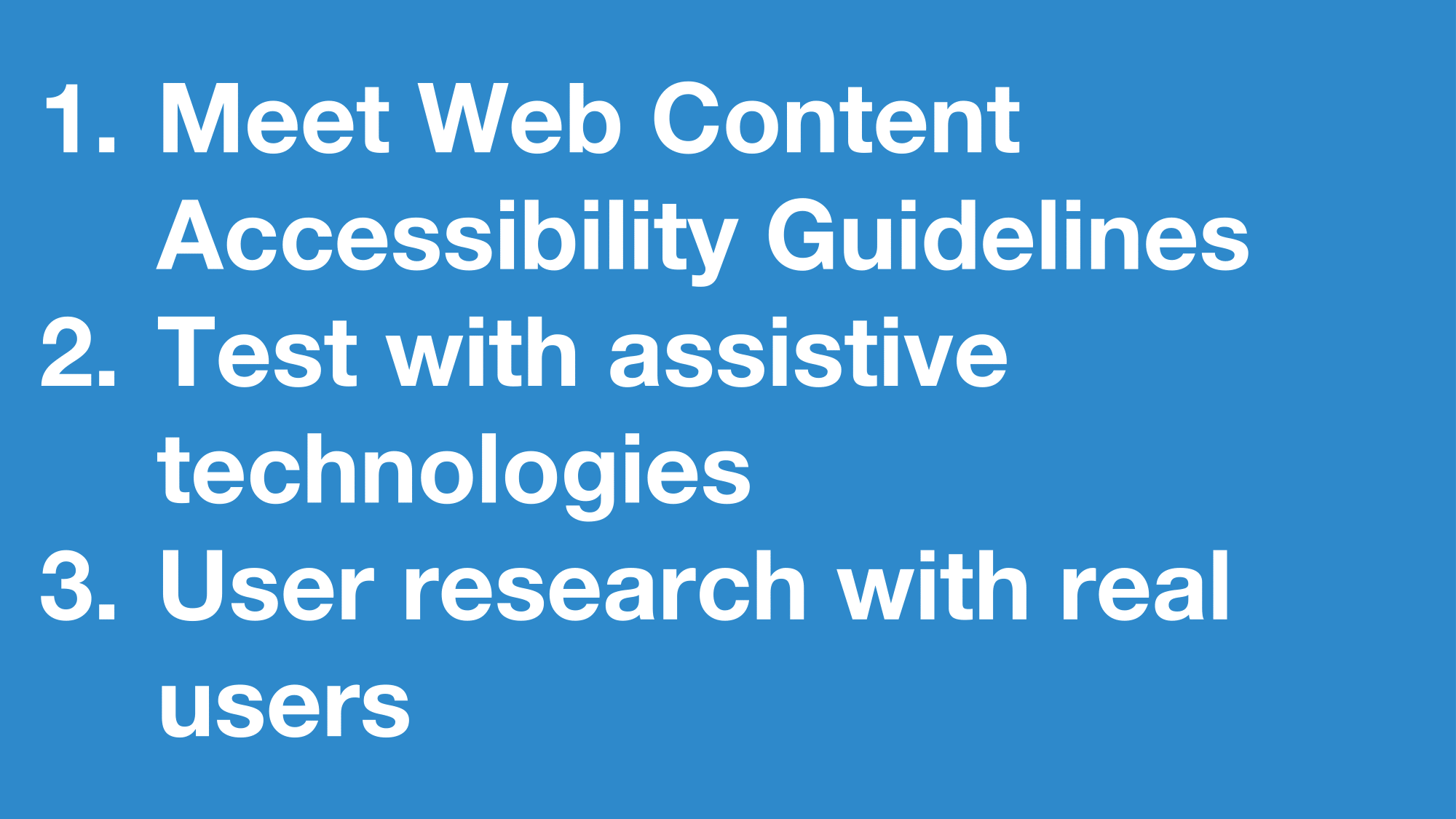
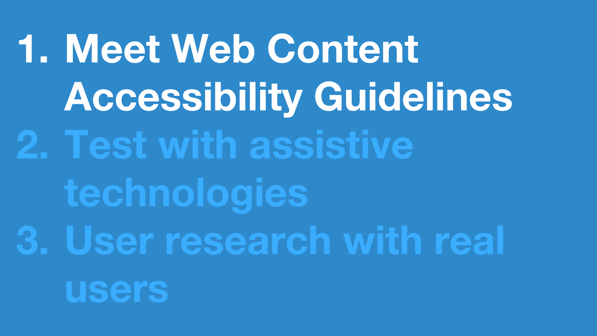
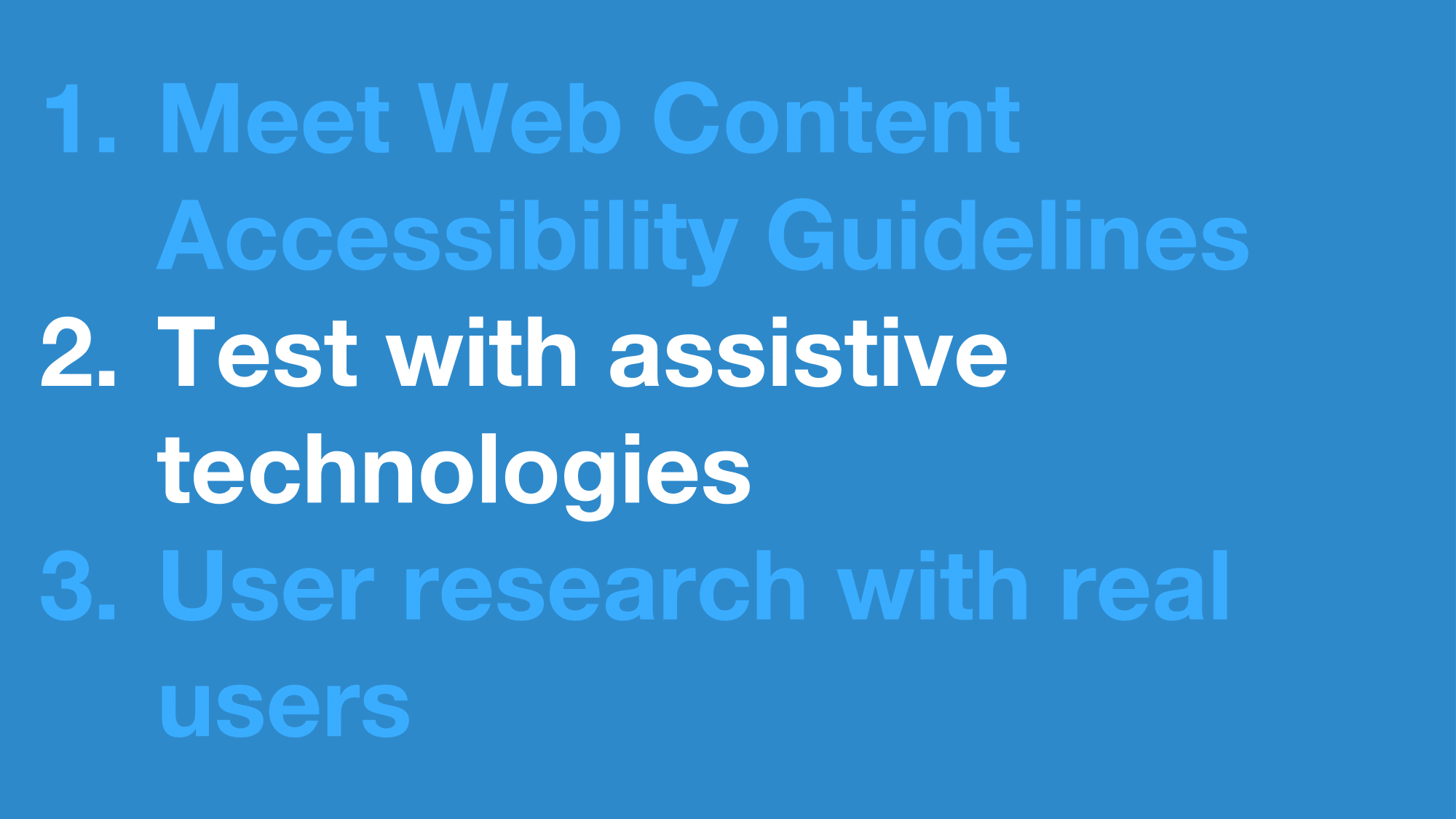
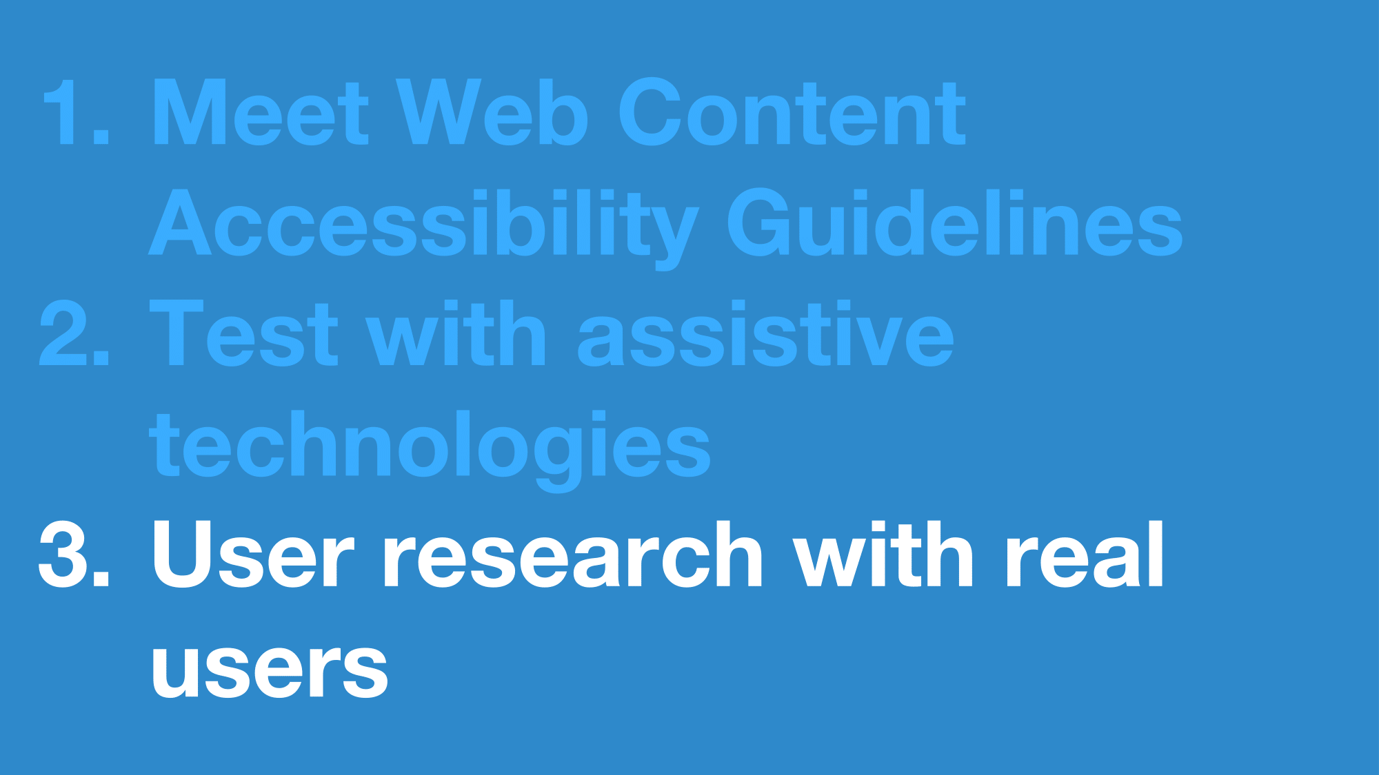
To meet government accessibility requirements , digital services must:
- Meet Web Content Accessibility Guidelines version 2.1 at level AA
- Test with assistive technologies
- include people with disabilities in user research
 Open full size image for slide 31
So I’m going to go through these one by one
 Open full size image for slide 32
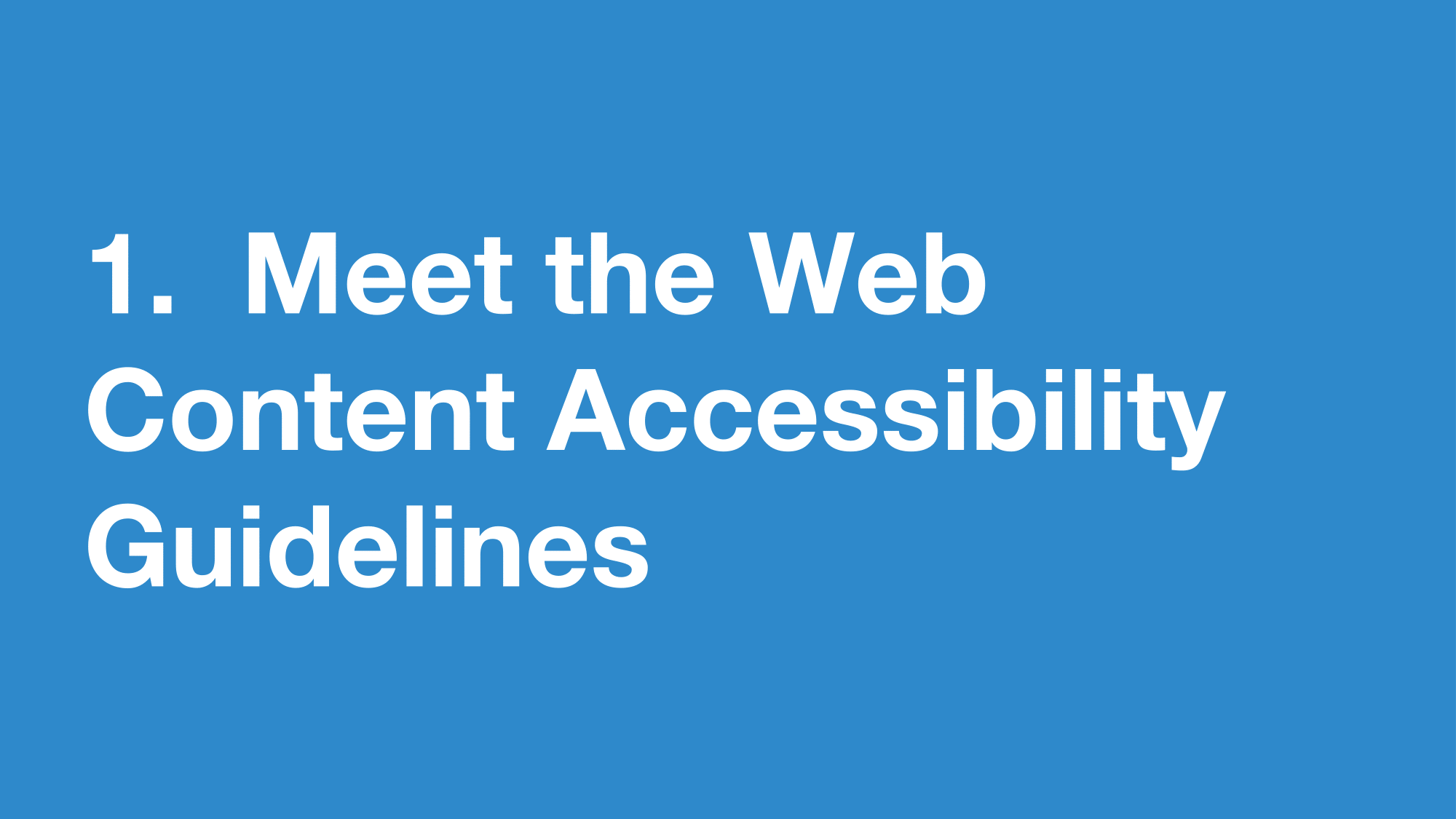
If you’ve not heard of WCAG (Web Content Accessibility Guidlines) before you can think of it like a standardized accessibility design manual.
They are an internationally recognised set of recommendations for improving web accessibility.
They explain how to make digital services, websites and apps accessible to everyone
 Open full size image for slide 33
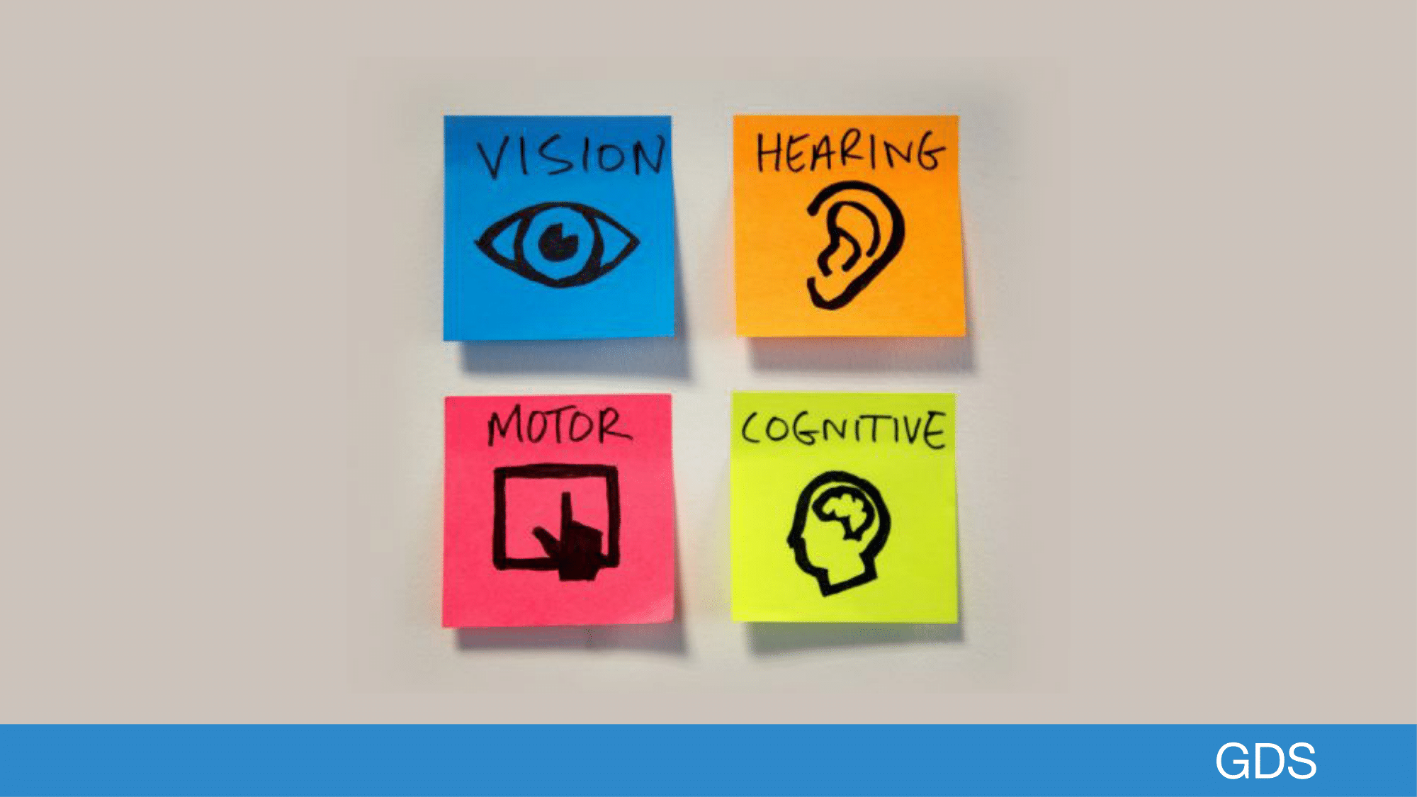
This includes users with impairments to their:
- vision - this includes people with sight impairments and colour blind people
- hearing - like people who are deaf or hard of hearing
- motor - like those who find it difficult to use a mouse or keyboard
- cognitive - like people with dyslexia, autism or learning difficulties
 Open full size image for slide 34
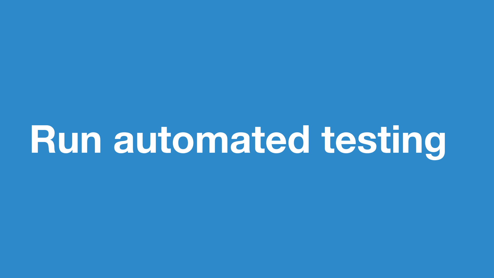
If you’re new to WCAG, it can be a bit daunting, so one place you could start is by running an automated test for accessibility
 Open full size image for slide 35
There are many different automated tools but I’ve personally found that aXe works really well for a lot of use cases, and it’s what we use on the Design System
 Open full size image for slide 36
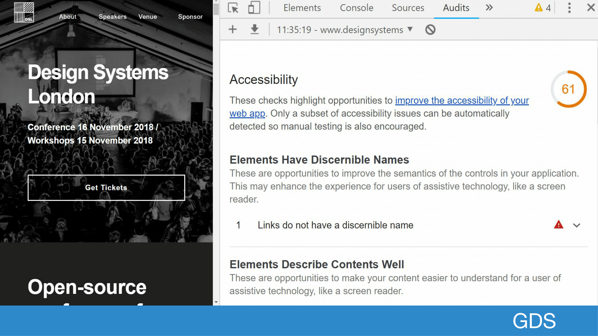
If you want to use it, it comes in every version of Google Chrome developer tools.
You can find it under the lighthouse audit option, and it runs as part of the accessibility step.
 Open full size image for slide 37
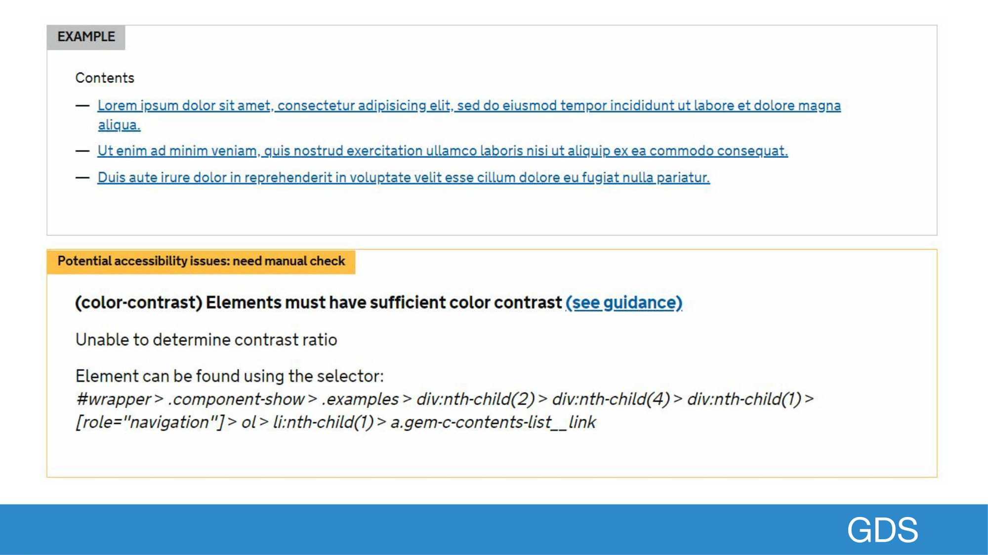
Axe is also useful because it can be reused in many different circumstances, so here’s an example of a component within a component library that has accessibility warnings alongside the example which makes it easy to action.
 Open full size image for slide 38
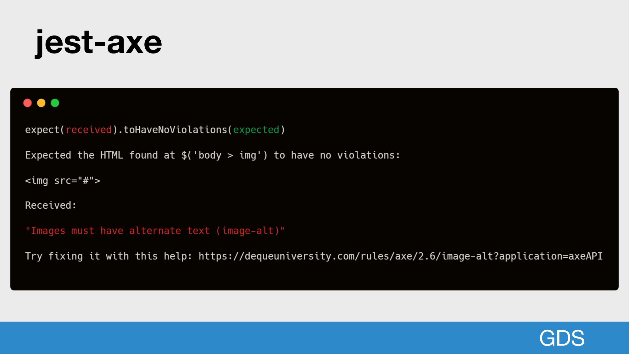
It can be also used in the command line, which is useful when writing unit tests that run on a continuous integration server as part of your development workflow.
 Open full size image for slide 39
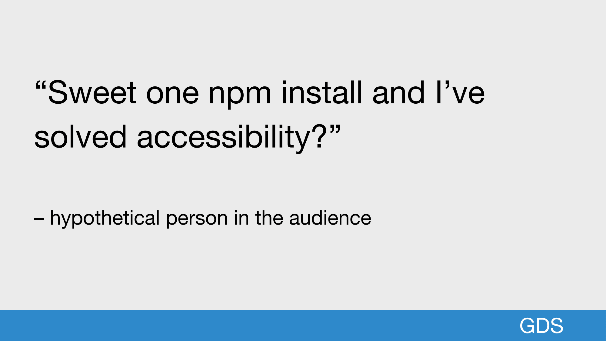
So you might be thinking, sweet, I can npm install this and it’ll solve all my accessibility issues.
 Open full size image for slide 40
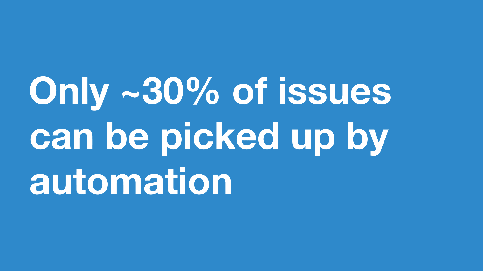
The accessibility team at GDS, built the least accessible webpage in the world, and tested as many automated tools on it as a possible.
They found that tools like axe can only pick up around 30% of issues
The other 70% needs to be done with manual testing.
 Open full size image for slide 41
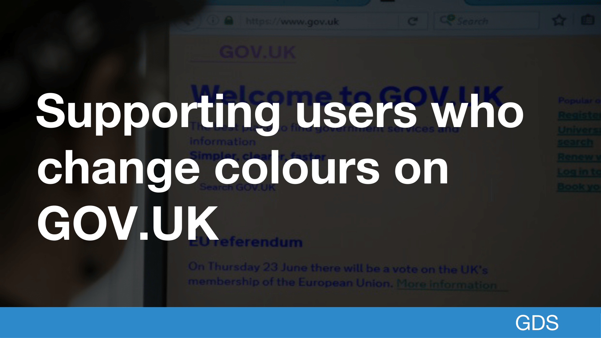
One example of manual testing is the work we do to make sure GOV.UK works when users change their colours.
While high contrast is normally associated with good accessibility, for some users it can cause visual stress that means they prefer to customise the colours they use to read your website.
 Open full size image for slide 42
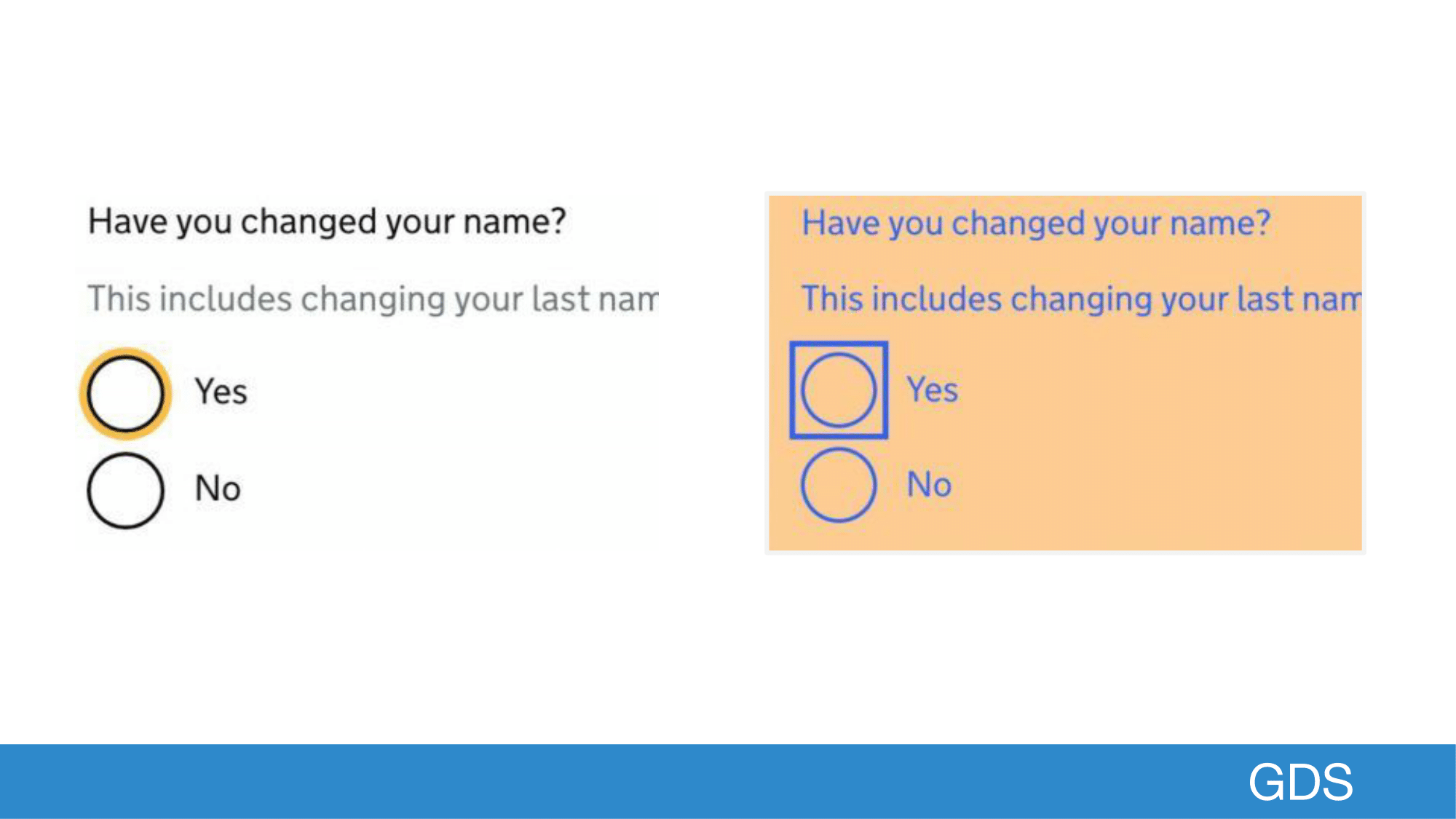
In this example I’m showing a radio group, that asks if the user has changed their name.
And the first radio input is focused.
Since our radio inputs are custom elements for improved usability, we have to do extra to make sure the custom focus is not lost when users change their colours.
So in the second example, there is a separate outline, that represents this focused input so that it’s clear what is being interacted with.
 Open full size image for slide 43
One other thing you might consider is to get an external accessibility audit, this can be really useful to get an expert’s insight into what you’re building.
 Open full size image for slide 44
The second thing I want to talk to you about is testing with assistive technologies
 Open full size image for slide 45
Assistive technologies help people to overcome environments that exclude them based on certain disabilities or impairments.
Common assistive technologies include mobility aids such as wheelchairs or crutches.
On the web we have some less known assistive technologies, which are equally as important.
 Open full size image for slide 46
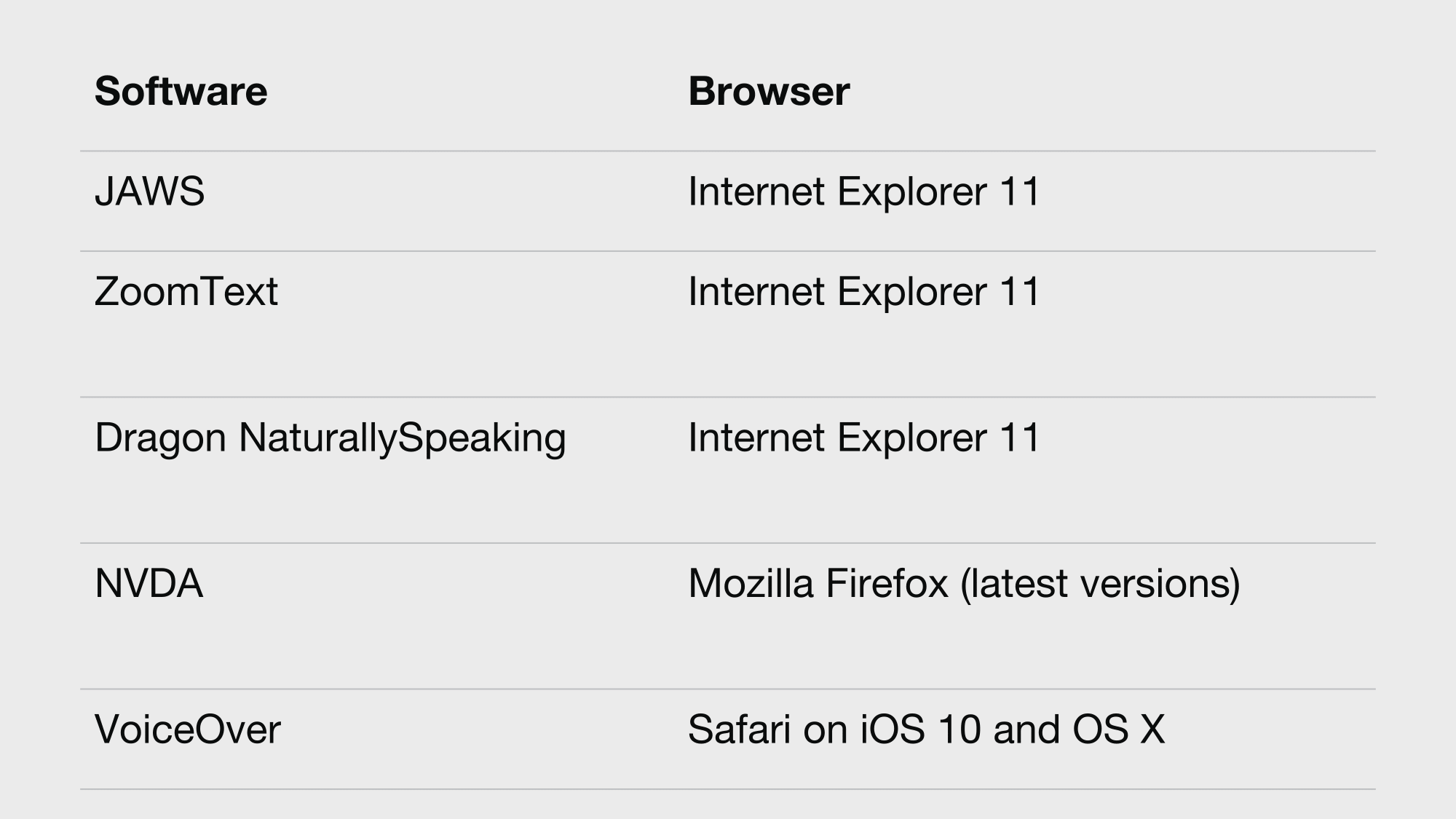
We test in the most commonly used assistive technologies.
JAWS, NVDA, and VoiceOver are all examples of screen readers.
Screenreaders can read out a webpage and are often used by people with sight impairments. However, they’re also used by people who have trouble reading english or people with dyslexia.
Often people with disabilities use multiple assistive technologies, which intersect with each other.
ZoomText is used to zoom pages often to over 400% their original size.
And finally Dragon NaturallySpeaking is used by some users that have mobility issues which allows a user to dictate commands with their voice.
 Open full size image for slide 47
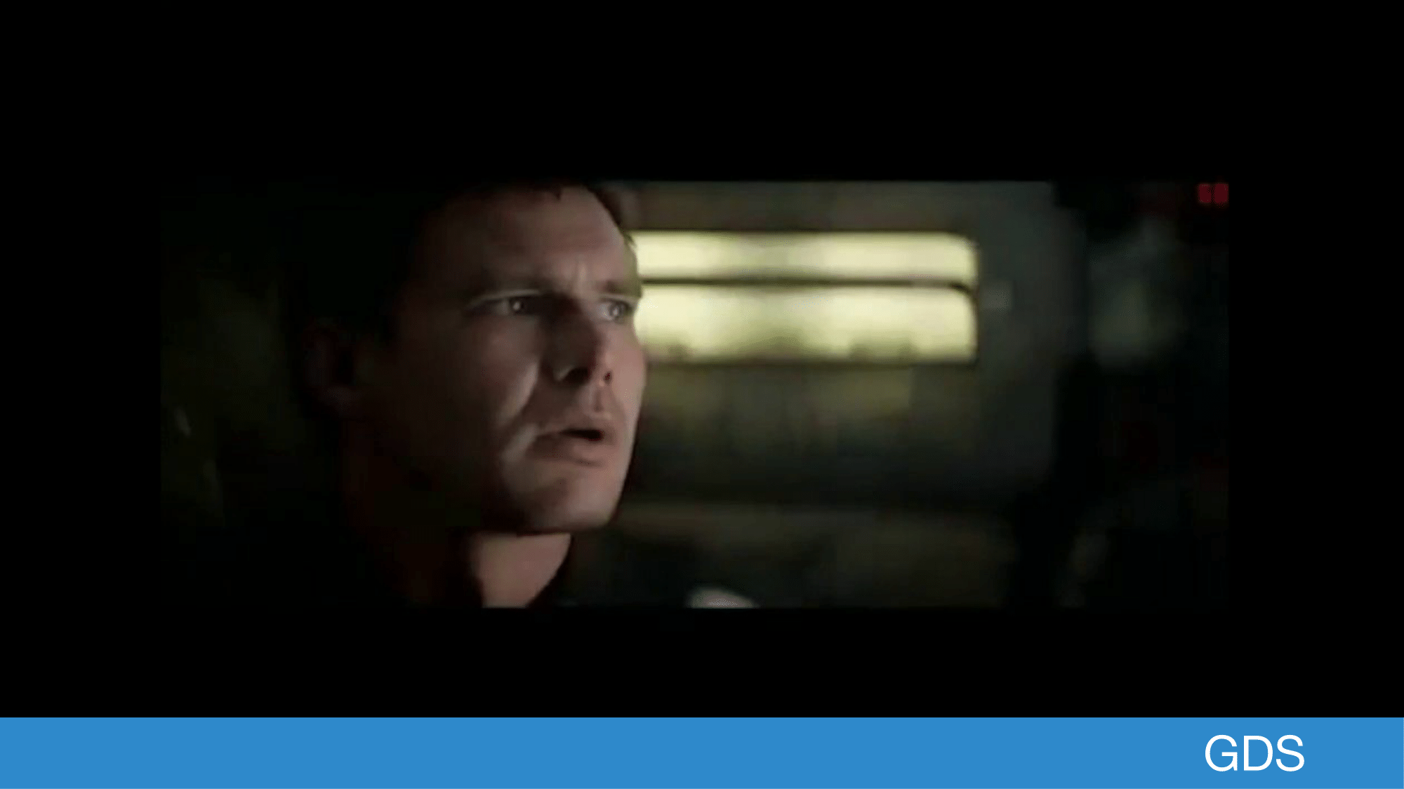
Has anyone seen bladerunner? With the scene where Deckard is zooming an image with his voice?
 Open full size image for slide 48
There’s this image he’s zooming into.
 Open full size image for slide 49
...
 Open full size image for slide 50
Enhance, he’s using his voice
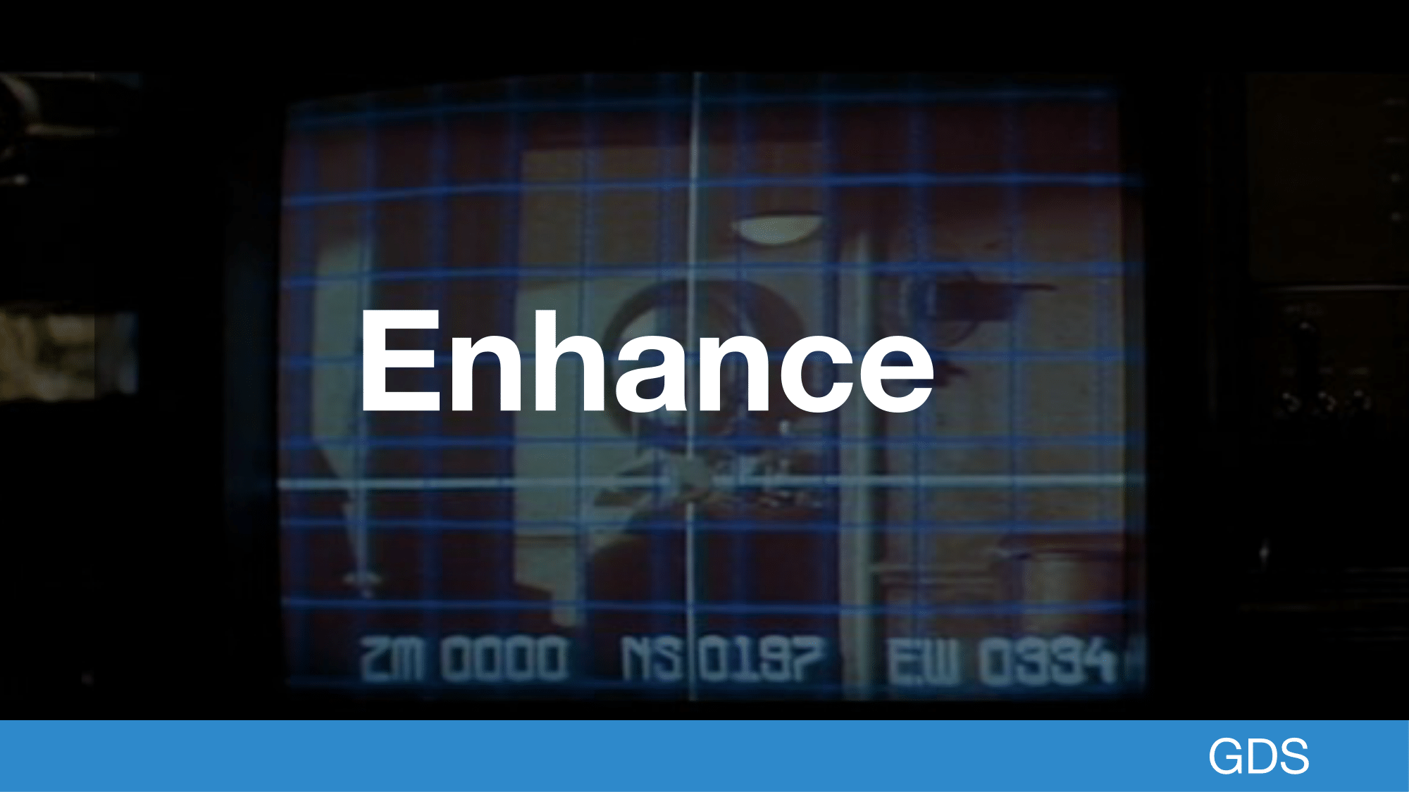 Open full size image for slide 51
Dragon NaturallySpeaking has a mode called mousegrid which is basically the same thing
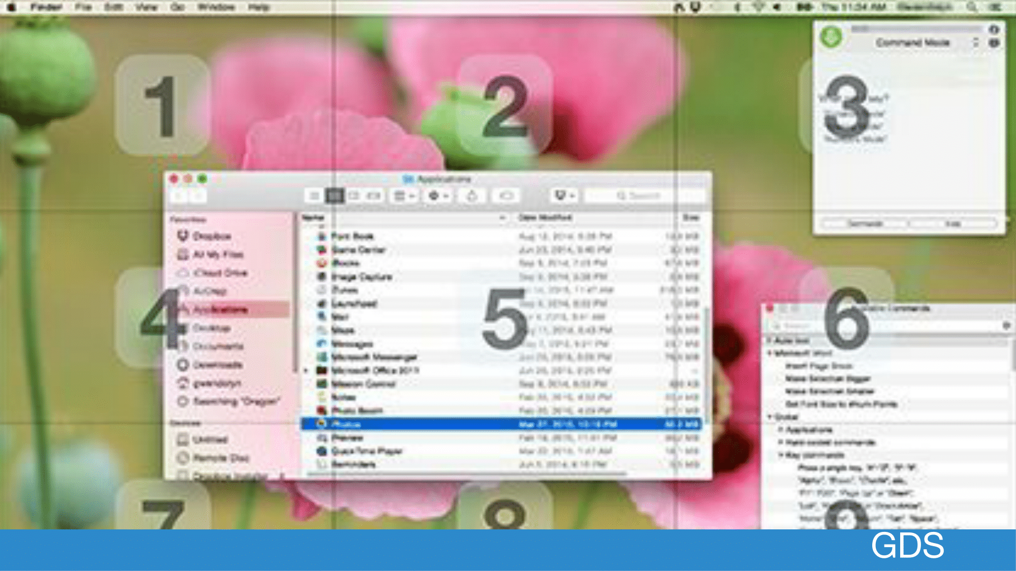 Open full size image for slide 52
We have put all these assistive technologies into what is called the Accessibility Empathy Lab, so that these are easy to pick and test.
 Open full size image for slide 53
Some of these tools are Windows only and cost money.
If you want to start, Anika from the Accessibility Team has written a blog post on tools you can use at no cost.
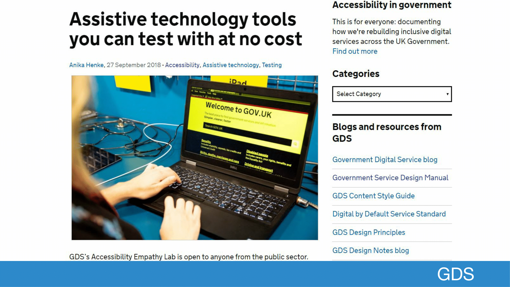 Open full size image for slide 54
When using assistive technologies, it’s tempting to try and fix oddities around how the technology works.
We can’t make decisions based on what we might consider to be odd, that is a regular experience for a person who actually uses these technologies everyday.
 Open full size image for slide 55
One frequent example of this is assistive technology mispronouncing content.
For example, We had one case where GOV.UK was being pronounced ‘governer’
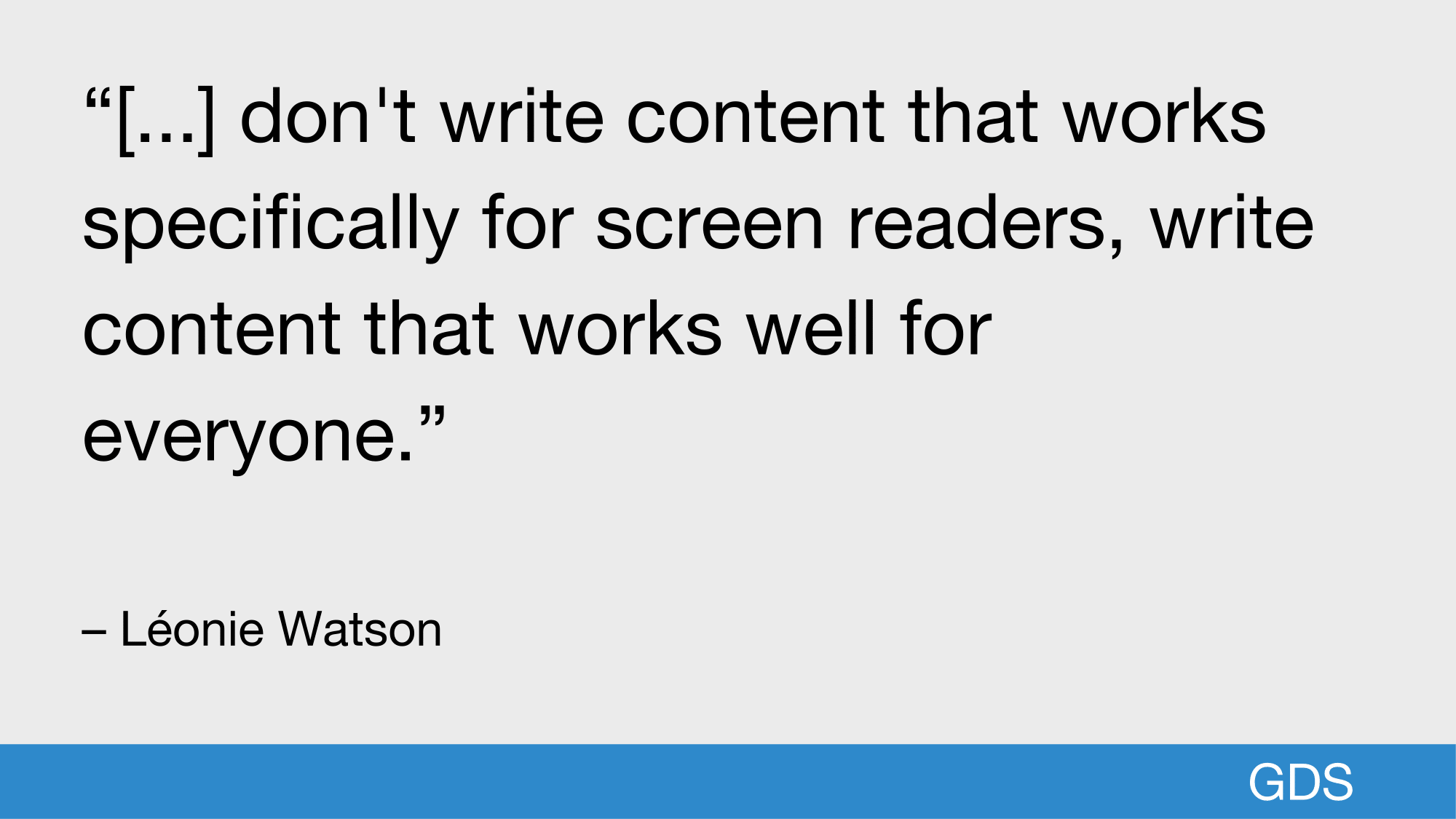
Through our Accessibility community, we often get asked about how to create content that works well with screen readers.
 Open full size image for slide 56
I think this quote from Robin is worth sharing where they say:
 Open full size image for slide 57
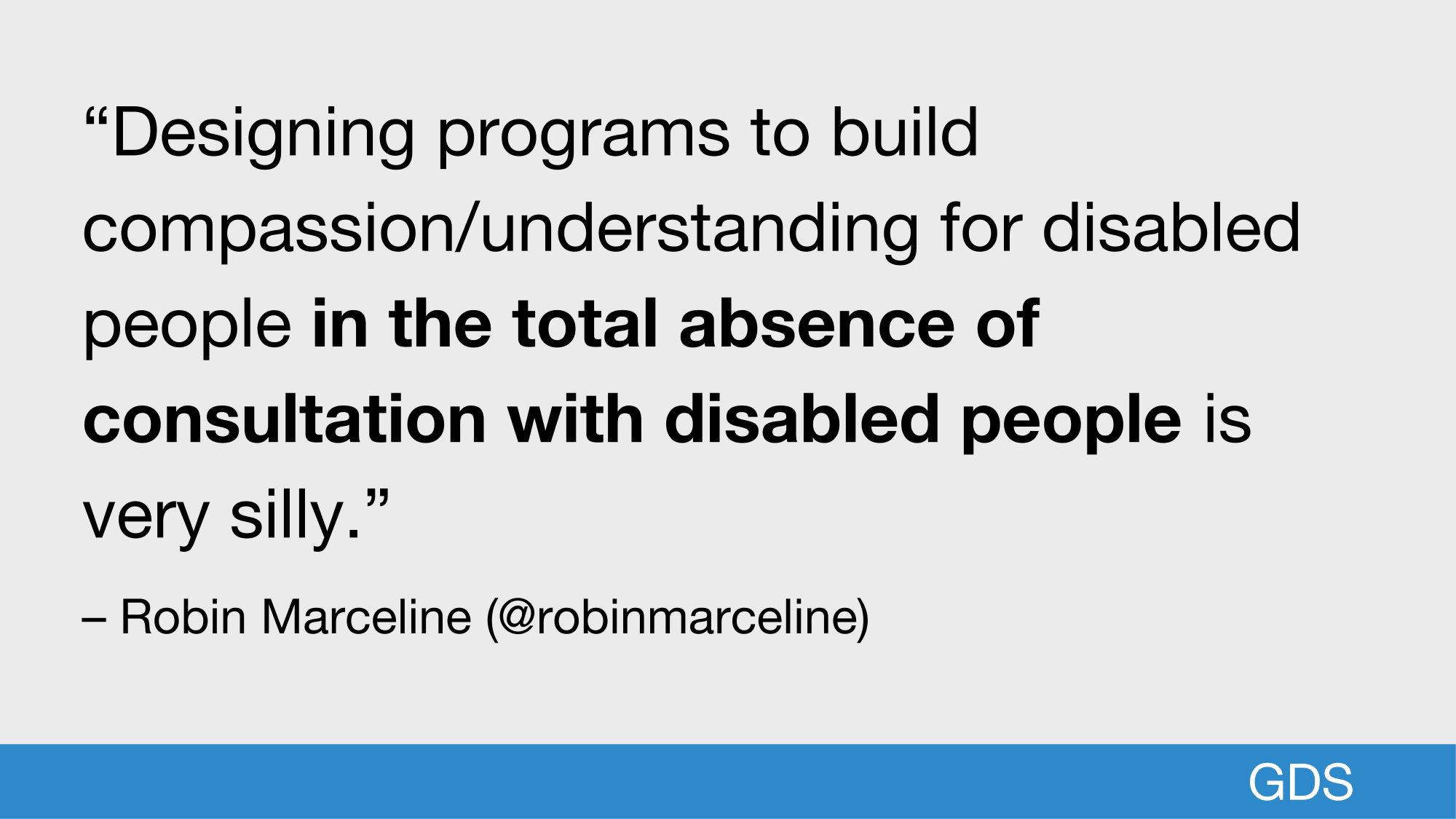
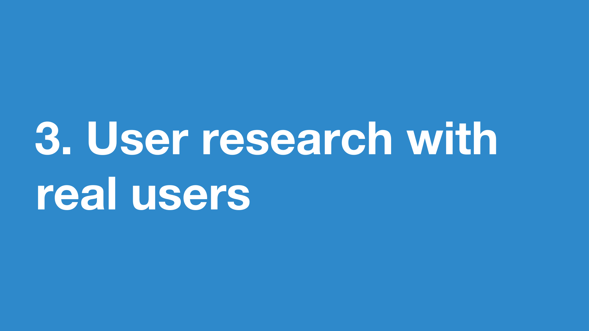
So this leads to the final step, including users with disabilities in your user research
 Open full size image for slide 58
One of the best parts of user centered design is doing research with your users, this applies to doing accessibility itself.
 Open full size image for slide 59
Our team doesnt build live services, so researching in a real world context can be difficult.
 Open full size image for slide 60
Doing research with users can be expensive, so we don’t want to do a full round of testing for one addition to the design system.
In the past, we have tried testing components on their own, but it puts users in an unrealistic scenario.
One way we’ve tried to get around this is to put multiple additions together and test them in a fake service.
This was really successful but is time consuming to put together.
 Open full size image for slide 61
The best research comes from the real world usage of components in real services.
 Open full size image for slide 62
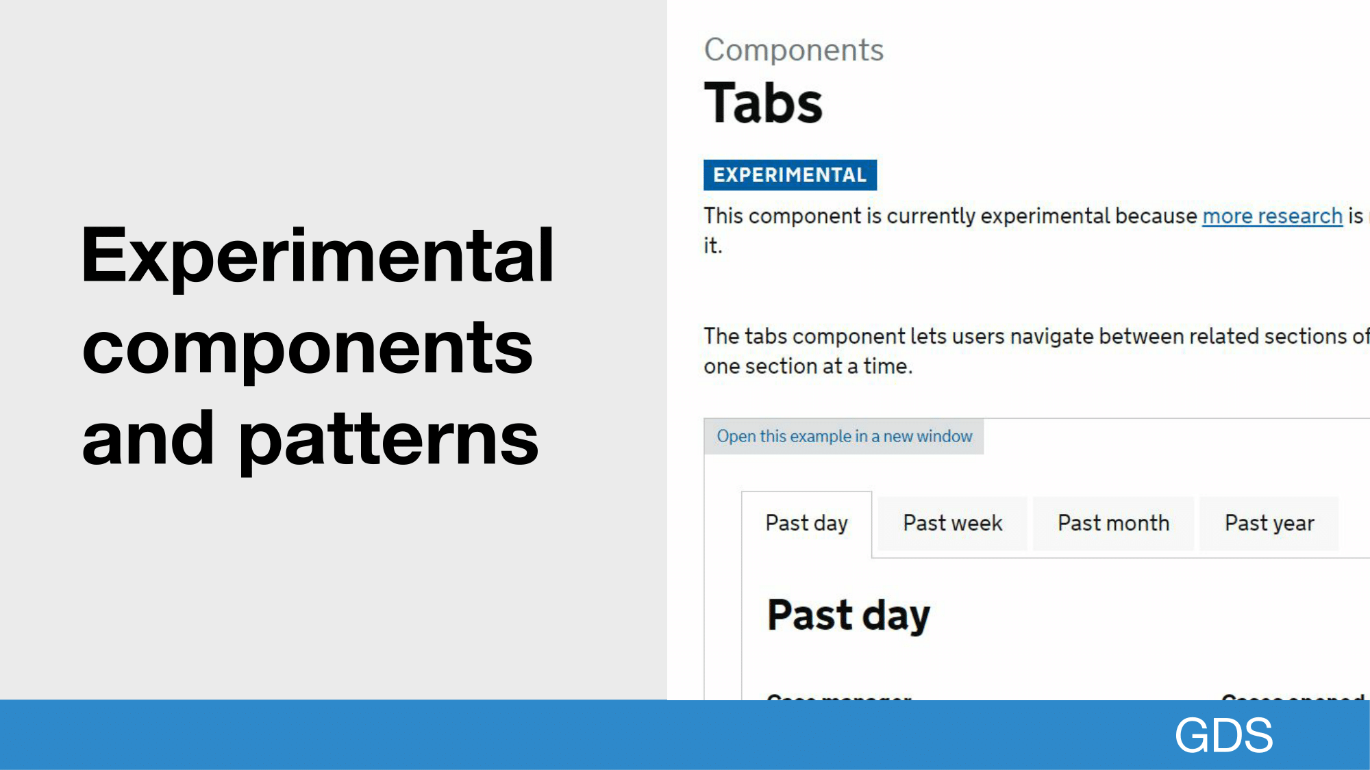
This is why for some components we have an experimental label, which allows us to ship a pattern or component that we think could use more research to validate it.
Over time we may decide to make another fake service with multiple experimental additions, but we hope by building more community and being honest we can get this research by real services teams.
 Open full size image for slide 63
I think with this all in mind, a design system is only as good as the community it represents.
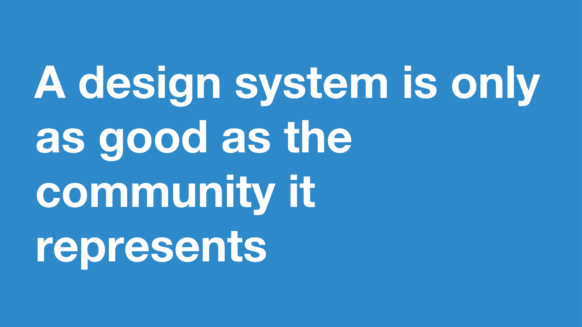 Open full size image for slide 64
Design Systems can’t make services accessible on their own
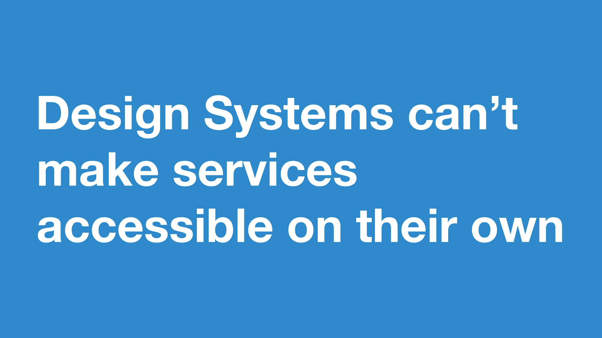 Open full size image for slide 65
One thing we’ve noticed is that a design system can mislead some people into thinking they don’t need to test their service.
 Open full size image for slide 66
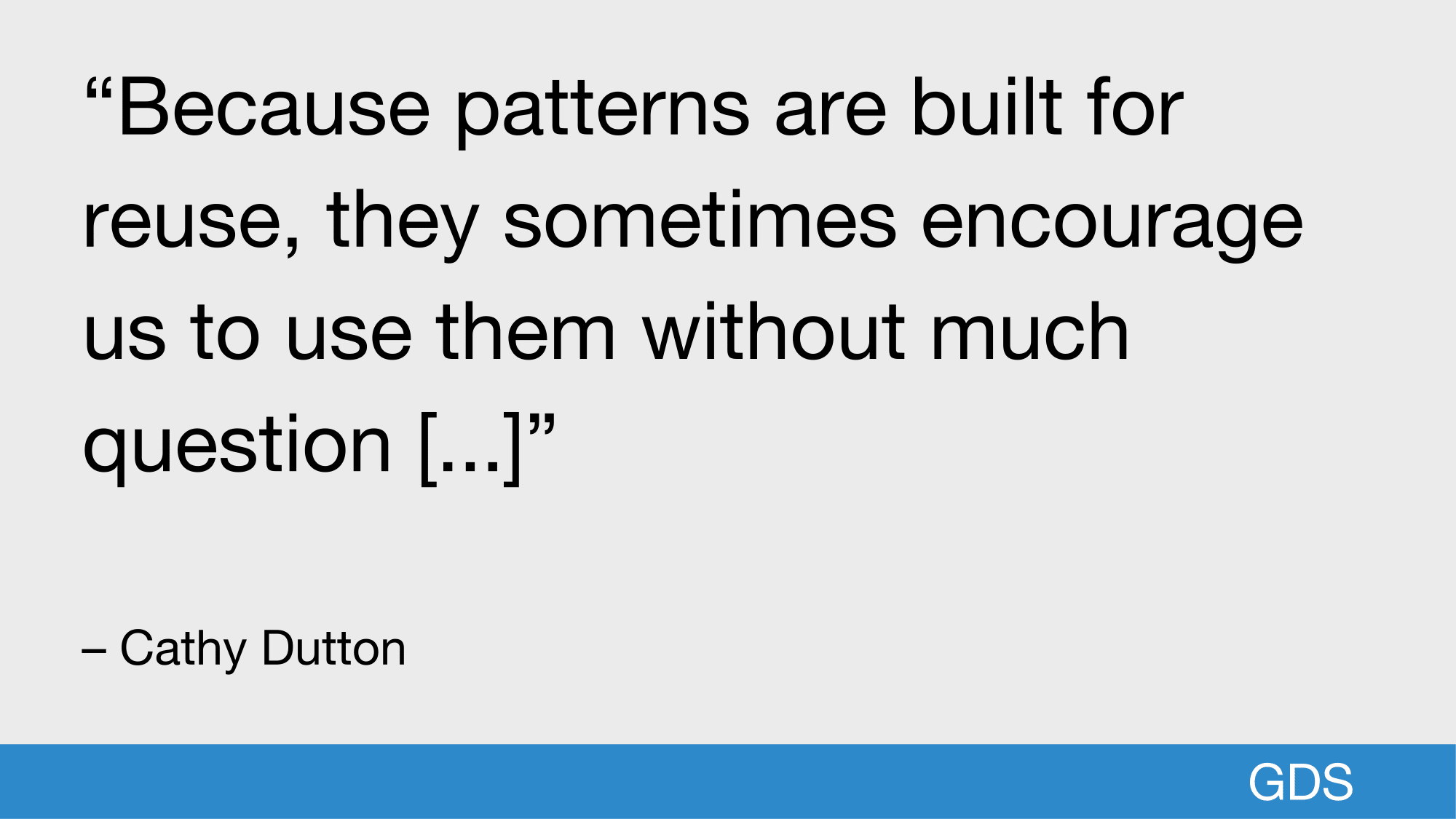
Cathy Dutton wrote about this in her article ‘Problem with patterns’, where she says:
"Because patterns are built for reuse, they sometimes encourage us to use them without much question [...]"
 Open full size image for slide 67
This is not a unique problem to accessibility, patterns in design systems can give people a false sense of security.
But they shouldnt replace the design process.
 Open full size image for slide 68
Design systems are a starting point
Everything I’ve covered here ideally should also be done by the service teams we support.
 Open full size image for slide 69
By fixing the most basic accessibility issues we give service teams the time to focus on the harder problems.
 Open full size image for slide 70
When building design systems we have a lot of responsibility, we can make inaccessible patterns wide spread or take the opportunity to make all our services more accessible by default.
But if you’re starting out, don’t worry about being perfect, as Leonie Watson says: “Do just one thing to make it a little better than yesterday”
 Open full size image for slide 71
Thanks
 Open full size image for slide 72
Footnotes
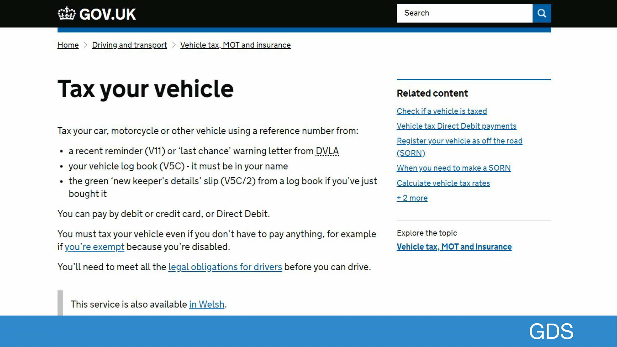
- "Tax your vehicle" ↩
-
I was introduced to this awesome bit of guidance from
Tatiana Stantonian
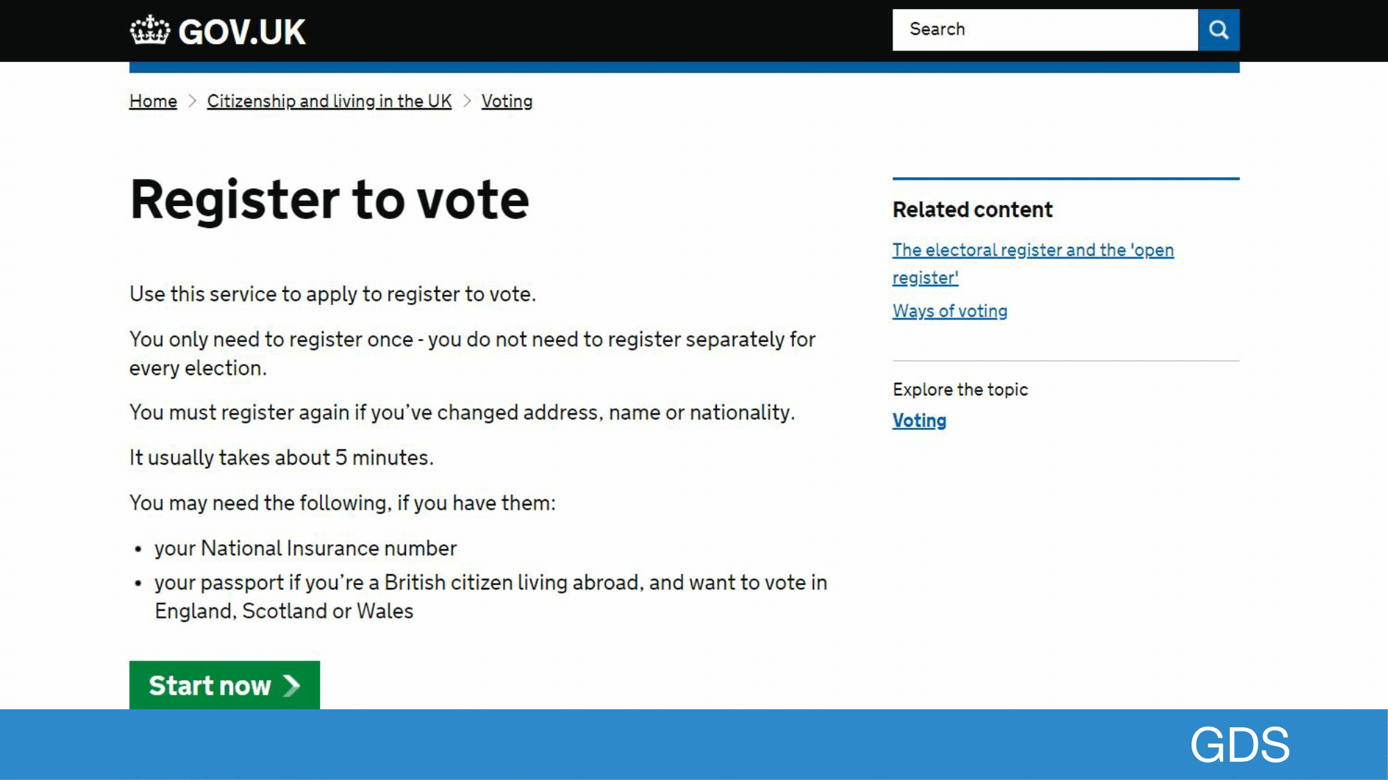
"Keeping a pet pig or 'micropig'" ↩ - "Register to vote" ↩
- You can read the beginnings of GDS and GOV.UK in "A GDS story" ↩
-
In Martha Lane Fox’s report
"Revolution not Evolution"
"Number 10 feel it is preferable to go from 750 top level website domains (eg www.cabinetoffice.gov.uk) to a single top level website domain for all of central government."
"The user should not have to navigate the departmental structure of Government before finding the service or content what they need." ↩ ↩ - If you query GOV.UK’s Search API it will give you a total, as of writing this is 376,518. ↩
- Activity on GOV.UK: web traffic ↩
-
You can see how many services there are with the
Service data dashboard.
As of writing there are 780 services, with 1.03 billion completed transactions per year. (384 services out of 780.) ↩ - Building a better GOV.UK, step by step. ↩
- Transactional services have a Start page that is on www.GOV.UK and links to a specific service domain. ↩
- Introducing the GOV.UK Design System ↩
- Disability facts and figures ↩
-
Microsoft Inclusive is really well referenced, their new toolkit is really good and worth a read,
even if it’s confusingly in a PDF...
Microsoft Inclusive Design ↩ - Who Uses Closed Captions? Not Just the Deaf or Hard of Hearing ↩
-
- Equality Act 2010: guidance
- EU Directive on the Accessibility of Public Sector Websites and Mobile Applications
- Make your public sector website or app accessible
-
I’ve learnt so much from the Accessibility team at GDS, and this guidance is amazing, which is the basis for the middle section of my talk.
I highly recommend you read this: Making your service accessible: an introduction . ↩ - We follow WCAG 2.1 as a minimum to level AA: Web Content Accessibility Guidelines (WCAG) Overview ↩
- ↩
-
- What we found when we tested tools on the world’s least-accessible webpage
- How do automated accessibility checkers compare?
- ↩
- Getting an accessibility audit ↩
- Assistive technologies: what to test ↩
- ↩
- Creating the UK government’s accessibility empathy lab ↩
- Assistive technology tools you can test with at no cost ↩
- How to create content that works well with screen readers ↩
- @robinmarceline’s quote on designing programs to build compassion ↩
-
- Youtube: Building Accessible Components and the GOV.UK Design System
- What we learned from getting our autocomplete tested for accessibility
- Character count component testing and user research
-
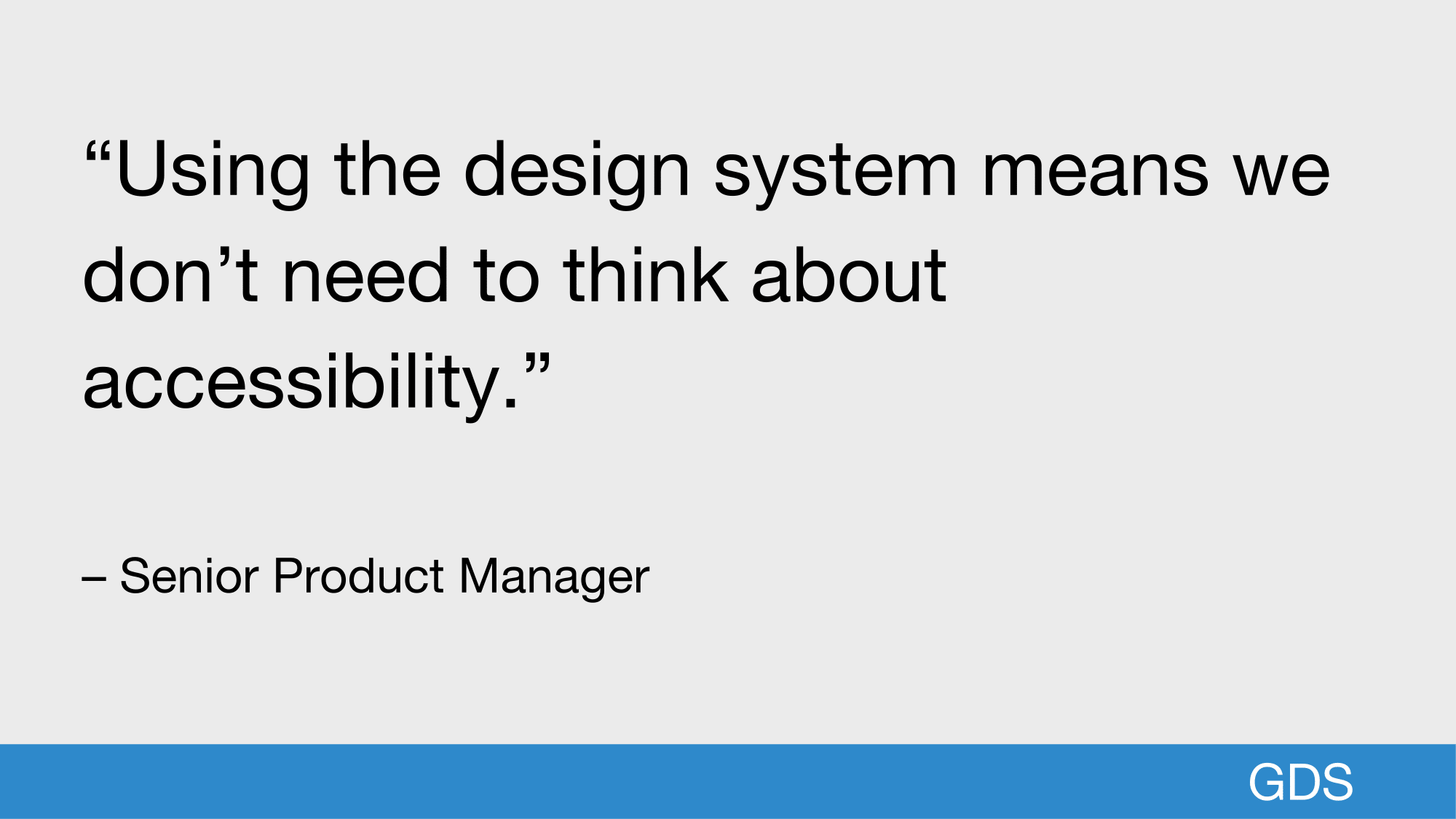
The quote on screen I actually made up because the real one was not grammatically correct, so this is a bit cheeky but we have consistently seen this in research.
Some real quotes:- “[...] the things that would make a service not accessible, the work has already been done by GDS so we don’t have to keep doing it.”
- "Once we have the first prototype, my starting point is the GOV.UK prototype kit, I trust that I know it’s been built with accessibility in mind."
- "Having the prototyping kit now means that it is accessible"
- "Things like design patterns, 80% has already been done and tested by GDS or other services."
Thanks to Katie John and Bekki Leaver (GDS User Researchers) for these quotes. ↩ -
This criticism has come from multiple places, and I wanted to highlight it in this talk.
- The Problem with Patterns
- Design Systems — the means, not the end
- “These are platforms for us to look at harder problems. [I’m] just cynical of things like design systems seen as ‘the design is done’” – Simon Wilson (@ermlikeyeah)
-
I’ve learnt so much from Léonie which is why her work appears multiple times in this talk.
Léonie Watson / Technologic (Human After All): Accessibility remix ↩